ShopDreamUp AI ArtDreamUp

Deviation Actions


Suggested Deviants


Suggested Collections


You Might Like…


Featured in Groups


Description
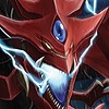
Overdue giftart for a friend.
Yami Bakura with his spirits, tried out a few different digital painting techniques, let me know what you guys think?
Paint Tool SAI, Photoshop CS3, Wacom Bamboo
Yami Bakura with his spirits, tried out a few different digital painting techniques, let me know what you guys think?
Paint Tool SAI, Photoshop CS3, Wacom Bamboo
Image size
900x1165px 841.76 KB
Comments82
Join the community to add your comment. Already a deviant? Log In
I like the feel of this image, but as I look at it more closely, I feel there's a few things that could be improved upon:
The way the clothing is colored is done well, and seems to give it the texture of fabric, except, I think, for the button-up he's wearing. The folds towards the bottom look unrealistic (a nod to the ridiculous shapes it takes on in the anime/manga, I'd imagine), and at some points, such as near his collar or on the sleeve of his foreshortened arm, the fabric simply seems too "thick" and makes the shirt look really strange. There's also a very sharp line that separates his pants and the surroundings, which also seems a bit odd.
His posing is fine—somewhat dramatic and interesting, although he seems just a bit off-kilter (like perhaps he'd be falling over). The right hand (his left) seems like it should be balled up into a fist, but without line or shape or stress indication on the palm or the wrist, the hand doesn't look natural. The lack of real "separation" between the arm and hand at the wrist area adds to this. The left hand (his right) is foreshortened relatively well, but looking at the fingers there for too long sort of breaks the illusion, because there seems to be a strange size discrepancy between them, they're all pointed too much in the same direction and angle, and there's a lack of proper spacing between all the fingers, except for the thumb and forefinger.
The face bothered me at first, but the more I look at it, the more I find it fits with the style. It's very hard to portray the exaggerated expressions the character take on in the anime/manga in a semi-realistic manner, but I think you've done a good job of it here. His hair looks good (the signature little "wings" on the top of his head bug me, but that's just a choice I wouldn't make with this style), except on the left side where it seems to flair out far too uniformly. The color and shading on the skin is good, although I would've liked to see some tinting (both on his skin and clothing and hair, etc) from the dark-colored environment. The only real light source seems to be the "DEAT-" behind him (and Necrofear's glowing, I guess), but he almost seems lit from all places EXCEPT from behind. The surroundings don't give a feeling that they'd have a lot of ambient light, so it looks a little strange to have it that way.
Onto what is probably my most subjective issue, and that's the color composition. I found myself searching for some kind of large contrast of color between all of the blue in this image, and while there is some in the letters, Bakura's skin, the Millennium Ring, and Dark Necrofear (in general), it still seems to all meld together. I'd have liked to see better contrast in the background (a more reddish shade of purple, maybe) or something like that.
Overall, I think it's a good piece, there's just a few things that really stood out as needing some tweaking.